March 2026
From Spreadsheet to Dashboard in 10 Minutes
Everyone has data. Almost no one has a dashboard. How AI tools are changing that, with a real walkthrough.
Practical Guide | ~7 min read
Everyone has data. Almost no one has a dashboard.
That's the strange reality of 2026. Companies sit on mountains of CSV files, spreadsheets, and exports. Sales numbers, inventory logs, customer feedback, operational metrics. The people who need those insights most are staring at rows and columns. Not because they don't care. Because turning data into something visual, interactive, and useful has traditionally required a developer, a designer, and a budget.
That's changing. I want to show you exactly how. And I want to start with a story that changed how I think about this.
The Moment It Clicked
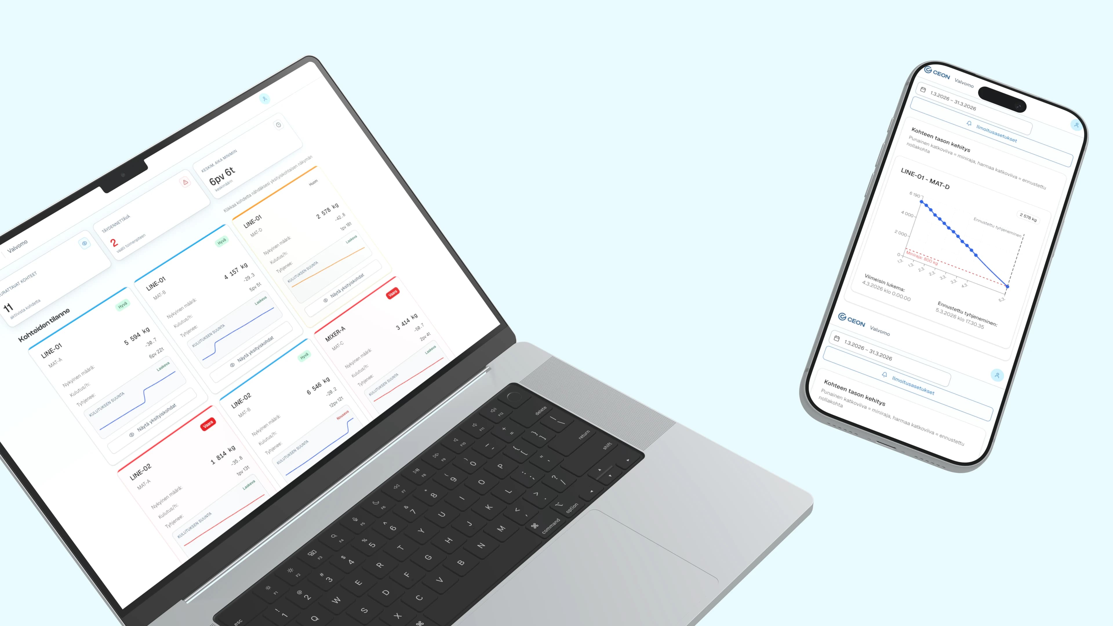
Last year I had a discovery meeting with the owner of a family-owned materials company. They serve industrial customers who operate storage silos, and those silos send fill-level reports via email every six hours. Structured data, arriving reliably, four times a day.
Here's what happened to that data: someone opened every email, pulled the numbers out, and typed them into Excel. Multiple times a day. The decision at the end is always the same: deliver more material or not. But the process to get there was entirely manual. No trends. No predictions. No way to see when a silo would actually run low.
Twenty minutes into the meeting, the full scope was clear. I opened v0 and started generating the dashboard while we were still talking through the process. Silo fill levels, trend lines, alerts for when levels drop. By the end of that first session, the owner was clicking through a working prototype, seeing his business in a way he'd never seen it before.
We refined the design in Figma and built the production version on Firebase. The daily copy-paste loop disappeared. Emails that had been manually processed for years now feed directly into a live dashboard with historical trends and forecasting.
That project changed how I think about this problem. The data had always been there, four times a day, every day. It just needed to be freed from inboxes. Nobody had connected the dots between existing data and a simple visual interface.
This wasn't about making charts faster. It was about unblocking an entire category of organizational need that had been permanently deprioritized.
The Gap Between Data and Understanding
Here's a scene I see constantly in my work with B2B organizations:
A team lead exports a CSV from their CRM. 3,000 rows, 15 columns. Somewhere in that file are the answers to questions leadership has been asking for weeks. Which accounts are at risk? Where are the bottlenecks? What's trending up?
The file sits in a shared drive. Someone opens it in Excel and sorts a column. Someone makes a bar chart that tells half the story. The data exists. The insight doesn't.
This isn't a technology problem. It's an access problem.
The tools to create interactive data visualizations have existed for years. D3.js, Tableau, Power BI, custom React dashboards. They all require specialized knowledge that most people in most organizations don't have.
Global data is projected to reach 181 zettabytes by 2026. Organizations are drowning in information they can't use. AI-powered visualization tools save analysts an estimated 8 hours per week (ThoughtSpot, 2025), but those savings only reach people who have access to these tools. Most don't.
What AI Tools Actually Make Possible
I'm going to be specific here, because vague AI hype helps nobody.
The landscape has split into two categories:
Category 1: AI Data Visualization Tools
Purpose-built for turning data into visuals:
- Julius AI connects directly to databases and spreadsheets. Ask questions in plain English, get charts and summaries. No code.
- Microsoft Data Formulator (open source, v0.7 as of March 2026) offers 30 chart types with AI agents that help you explore data iteratively.
- Bricks sits between Canva and Tableau. Upload a CSV, get a dashboard in minutes. Built for people who find Tableau overpowered and Excel underpowered.
- Fabi.ai focuses on collaborative data notebooks that sync to Slack and Google Sheets.
Category 2: AI Coding Tools
These build fully custom interfaces. Not just charts. Complete applications:
- Cursor and Claude generate working code from natural language.
- v0 by Vercel generates production-grade UI components.
- Bolt and Replit create full-stack applications in the browser.
Category 1 gives you better charts. Category 2 gives you custom tools. Both are useful. But Category 2 is where the shift is. Anyone who can describe what they need can build software that didn't exist before.
Visual: Simple diagram showing Category 1 (data to charts) vs Category 2 (description to custom application)
What Speed Actually Looks Like
The silo monitoring dashboard wasn't a one-off. I've spent the past year building VitaliOS (my personal operating system) using these exact workflows. At some point I started keeping track of the timelines.
| What I Built | Traditional Timeline | With AI |
|---|---|---|
| Interactive workshop tool (Mentimeter alternative) | 3-5 days | 1 hour |
| Project task board from FigJam export | 1-2 days | 15 minutes |
| Client documentation portal | 2-3 weeks | 15 minutes |
| Industry research dashboard | 1 week | Overnight batch |
| EPK generator with live preview | 3-5 days | Minutes |
| Silo monitoring dashboard | Manual email-to-Excel | First session |
I'll be honest: these numbers surprised me too. The first time I built something in 15 minutes that I'd previously quoted two weeks for, I sat with it for a while. The economics of building custom tools had fundamentally changed, and most organizations hadn't noticed yet.
Adobe's 2026 Creative Trends report found that 58% of professional designers now use AI generation tools at least weekly. Searches for "vibe coding" (a term coined by AI researcher Andrej Karpathy in February 2025) jumped 6,700% that year alone (Exploding Topics). The adoption curve isn't gradual.
Why This Matters Beyond Pretty Charts
The dashboard is never really the point. The point is the decision that didn't get made because the data wasn't visible.
McKinsey estimates AI could add $2.6 trillion in value to marketing and sales alone (McKinsey Global Institute). Most of that value is locked inside organizations that can't see their own data clearly enough to act on it.
When anyone on a team can turn data into an interface, the bottleneck disappears:
- Product ops builds their own reporting dashboard
- Sales creates a pipeline visualizer that updates in real time
- Finance generates investor-ready reports from raw accounting data
- HR creates interactive onboarding from static documents
This isn't about replacing developers. The developer still builds the production system. The AI-empowered team member builds the prototype, the proof of concept, the internal tool that makes their work better today. Without waiting eight months in a backlog queue.
I think this is the beginning of a much larger shift in how organizations build internal tools. But that's a bigger argument for the next post.
Getting Started Monday
I'm not going to pretend this is zero-effort. But the barrier to entry has dropped from "hire a development team" to "have a curious afternoon."
Pick one painful spreadsheet. The one your team opens every week and squints at. The one someone always has to "walk through" in a meeting because it's not self-explanatory.
Describe what you wish it looked like. Not in technical terms. In human terms. "I wish I could see at a glance which projects are behind. I wish I could filter by client. I wish the numbers told a story."
Choose your tool based on what you need:
- Just want better charts? Try Julius AI or Bricks. Upload CSV, ask questions, get visuals.
- Want a fully custom interactive dashboard? Try Claude, v0, or Bolt. Describe what you need, get a working application.
Share it with your team. Not as a finished product. As a conversation starter. "Is this useful? What's missing? What would actually change how we work?"
One spreadsheet. One afternoon. One conversation.
Visual: Simple 4-step infographic — Pick, Describe, Build, Share
What's Next
This is the first in a three-part series:
- Next: The Internal Tools Revolution (coming soon) — Why the people best positioned to direct AI aren't developers. They're design thinkers.
- Then: The Knowledge Engine (coming soon) — What happens when AI can turn scattered files into searchable, connected intelligence.
For now, go find your most painful spreadsheet. You might be surprised what 30 minutes can do.
Vitali Gusatinsky is a design consultant with 15+ years of experience working with B2B organizations. He builds tools, dashboards, and knowledge systems, and is currently developing Design Answers, a community for AI-powered builders.
If this article hit a nerve, start here
These are the commercial versions of the same problem. Less theory. More what to do when the problem is already costing time or money.
Service Transformation
AI Workflow Design Consulting
Use AI where it removes real friction in research, operations, and product work, not where it just adds a layer of hype.
Service Transformation
Internal Tools Consultant
Fix the workflows your team actually lives in every day, not just the customer-facing product everyone remembers to improve.
Working on something similar?
Most engagements start with a 20-minute call.
You leave with a clearer read on the problem — even if we don't end up working together. No deck, no pitch.